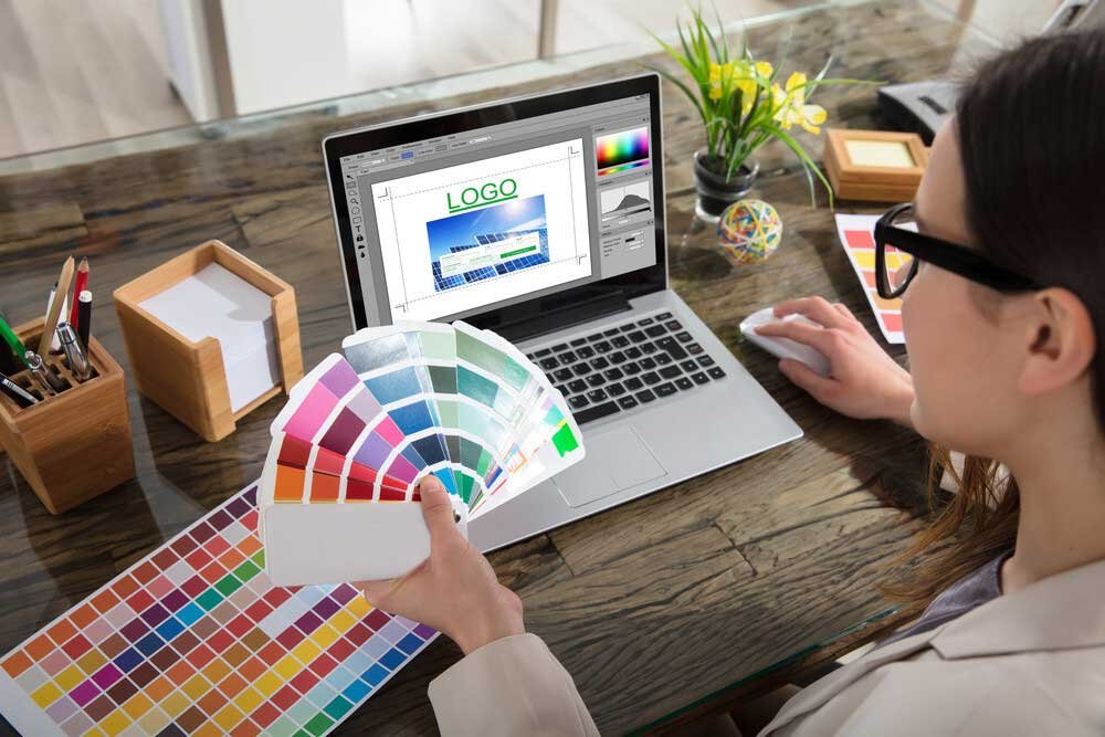
Logos are great as improving your marketing and increasing your brand recognition. A logo is a visual representation of brand, conveying your entire personality and ethos through the design, color and font choices.
A logo has the power to make your business appear more favorable to potential customers, and because of that, it’s important that you get it right so that people are encouraged to check out your business and hopefully your products and services. Here are some tips to help you make a great logo.
Make It an Image
They say a picture paints a thousand words, and that’s never been more apt than for logo creation. A lot of so-so logos only use text, and because of that their brand suffers because it’s not as recognizable and doesn’t have enough personality.
When making a logo it’s worth designing an image for it as this can be used to reveal a lot more about your brand, and it sticks in the head better. People can instantly recall the Nike tick, the yellow arches of McDonalds, and the smile of Amazon, so making a simple image for your logo can really help improve your brand awareness.
Furthermore, images take up less room, meaning that they can easily be incorporated in a lot of different mediums, such as business cards or merchandise. Adding a logo to a business card is easy and you can design a custom business card effortlessly to help get your business around and network.
Use Empty Space
Using empty, blank space in a logo can help it look clean and smart, so it’s important not to overdo it with your logo and try to have too many elements. Simplicity is best as it makes it far easier to remember and also makes the logo better to identify from a distance or if it’s shrunk. It can also help evoke emotions that might suit your brand, like calmness, organization and professionalism.
Use Shapes to Highlight Your Logo
Shapes are a great way to help make your logo stand out and become more eye catching. You can use a whole host of shapes like boxes or circles to encase your logo and make it pop more.
Boxing in logos also helps make your logo better suited for cross platforms as they work really well digitally on websites, as well as in letterheads, presentations, and merchandise.
Shapes can also be filled with gradient colors to take your logo to the next level and to help it stand out and appear attractive and sleek. It’s important not to rely on this gradient however to make your logo work as it also needs to be able to look great in black and white, as there may be instances where you’re restricted to these two tones.
Color Is Key
The color of your logo is super important as the combinations you use can create connotations that can help customers figure out what your business is about. It’s a good idea to learn about the psychology of color and what colors evoke what emotions, as this can help inform your design.
It’s best to keep the coloration simple and not to overdo it and use too many, as this can make it difficult to see. Stick to under four colors and don’t be scared to use different shades of the same color to create subtle contrasts within your logo.


